
I love the way version numbers are used in Open Source. Version 1.0 is not the first version released. Projects are well underway before they reach 1.00—if they even reach it. An open source maxim (by Linus Torvalds of Linux fame) is ‘release early, release often’. Get your code out there before it is perfect, because it can benefit from collaboration from the community. That is why we see version numbers like 0.15.2
Version 1.0 is reserved for the first version that sees the design intentions crystallised, the functionality in place, and all the first bugs accounted for. It’s what you would have wanted your first release to be like, except that it took all the releases in-between to get there:
We are very pleased to announce the release of IPython 1.0, nearly twelve years after the first release of IPython 0.0.1.
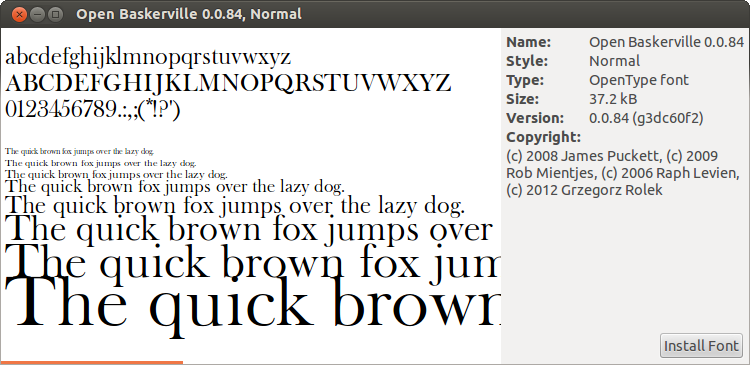
With the Open Baskerville project, we try to use this logic on a typeface. This is a screen shot showing the metadata of our most recently released font:
As you can see, we put the version number right in the font name. This has a practical reason: if there are going to be multiple versions, better make sure the user can tell them apart. But there is also a philosophical reason—we want to make it clear up front that our typeface is developed in an iterative way.
Iterations in the industry
Typefaces are not usually developed through release early, release often. When a designer or a foundry releases a typeface, it is usually considered finished: sometimes new technological developments warrant a new release, like when fonts first got released as OpenType, or now with the release of webfonts. The constant stream of updates as we know it from software teams is absent from type face development, even though most foundries refer to their work as software.
There are cultural reasons for this. One is that the industry of type design has until now not really embraced the malleability of digital typography. Ricardo Lafuente asks: why are people who make and sell typefaces still referring to themselves as foundries, as if they are still producing shapes cast in lead?
There are also practical reasons: once one has made a layout with a typeface, one does not usually want it to change—especially in the width of the letters and their spacing—as it would change the layout in unpredictable ways.
But the ideas in the Free Software and open source movements have found their way into the larger field of culture. Libre fonts—typefaces released as open source—have been a large success in recent years, thanks in no small part to web typography, where for a long time most traditional fonts could not be used because of licensing restrictions. But in the way in which they have are made, the fonts offered on sites such as the Open Font Library and Google Web Fonts do not really offer any innovation over the existing foundry model. They are mostly released by individual authors as a finished package. Projects that think about setting up a framework for collaboration and iterative development are rare—what is telling is that it is often not clear how to contribute back a change to the font.
This means libre typography is in a hairy spot. Even if conventional type foundries celebrate a personality focused idea of type design, the actual production takes place in tightly coordinated teams: the type designer can count on other designers to help him flesh out the alphabet, and foundries often reach out to specialists when it comes to specific areas of type design such as kerning and hinting. Individual designers working with free licenses will not be able to match these teams on production quality if they work by themselves.
To me it is clear that if libre typography wants to distinguish itself from its traditional counterpart, it needs to embrace alternative conceptions of type design. This can be by focusing on the possibilities of appropriation, remixing and forking of existing typefaces. Manipulating existing typefaces, either manually or through scripts, is only allowed only with libre fonts: the End User License Agreements of most typefaces explicitly forbid modification. Or it can be by embracing new collaboration methods and iterative processes, like we try to do with Open Baskerville.
How we collaborate on Open Baskerville
It is clear that the right tools for typographic collaboration still need to be built. But like I explain in I like tight pants and how it has come about that code hosting site github offers visualisations of typeface development, some elements of the underlying system are already showing up. The open font format UFO and the versioning process Git are a solid basis to built on.
A collaborator on Open Baskerville needs to have an account on Github and the software Git installed on ones computer. She first ‘forks’ our repository to her Github account: she now has her own version of the revision history. This fork she ‘clones’ to her own computer, using git.
The clone consists of all the files of the project, plus the version history. She now goes and makes changes in the files. When she is happy with the changes, she ‘commits’ them, and ‘pushes’ them back up to her Github repository. She opens a ‘pull request’ where she asks for the changes to be merged into our repository.
This is a rather involved process. Outside of software developers, not many people have experience with Git. The existing interfaces to Git are not intuitive to use, being geared to programmers directly editing source files rather than designers using a graphical tool. I think the complexity of this process is one of the barriers to contribution on our project.
It will be much more easy to contribute to Open Baskerville once there exist more easy ways to handle the version control. Whether in the form of plugins for font-editors, or a new editor built around collaboration.
What will stay the same in the future is the access we have to the revision history, as tracked in Git. In Open Baskerville, we use a set of scripts to be able to quickly generate a font package for each revision: we packaged them for other projects to use.
Formalising version numbers
In computer software the Semantic Versioning standard is an attempt to formalise generally accepted practices for attributing version numbers.
It distinguishes between MAJOR, MINOR and PATCH versions, corresponding to three period separated numbers: MAJOR.MINOR.PATCH (i.e. version 1.5.4) What is the difference between these categories? From Semantic Versioning’s specification, the guideline as to when to augment the MAJOR, MINOR and PATCH versions:
- MAJOR version when you make incompatible API changes,
- MINOR version when you add functionality in a backwards-compatible manner, and
- PATCH version when you make backwards-compatible bug fixes.
This makes the distinction between how a program is used and how it works on the inside. Changes to the code implementation that don’t change how the program appears to the user, merit only a change in the PATCH version. Adding functionality that appears to the user, without changing existing functionality, merits a MINOR version. Finally, changing the way in which you as a user have to use the program, means updating the MAJOR version.
However, this model does not seem really applicable to type design. This is because every change in the code, influences the visual product with which the designer works. My poster design might break more spectacularly if the fonts metrics change, by messing with my line breaks: but if the axis by which the bar of the e is slanted changes, that does ‘break’, in a more subtle way, my design as well.
This means that for fonts, unlike in software, every version is functionally different. Another reason why we chose to feature the version number prominently in the name of the typeface.
What the version means
Resuming the role of version numbers in Open Source, we have seen both the way in which a version number talks about the mindsets and the aims of a project, and the more formalistic definition of Semantic Versioning.
It is the metaphor of the long road to the first version that I find the most easily applicable to design projects. Every project start with a set of goals, aspirations, challenges. In the context of design, I would then rephrase the different types of version numbers as such:
- MAJOR version constitutes a coherent set of design goals,
- MINOR version constitutes a discrete goal obtained in pursuing these design goals and
- PATCH version constitutes incremental progress toward design goals.
For example, in Open Baskerville, the major design goal is to recreate Fry’s Baskerville in a way that is usable on the modern web (Version 1.0). As a sub-goal, we are first working to recreate a width faithful to Fry’s surviving specimen (version 0.1), with a system in place to create releases. We logged 83 incremental improvements towards this goal, but we are not there yet (thus, at version 0.0.83).
If we ever reach 1.0, what then? Can we think of a new major design goal for the project, or rephrase its design goal? We might want to re-inspire ourselves on other Baskerville variants, for example, and adjust are goals accordingly.
Where does it end? What is the final number? Is continuing working on one design project for years and years a desirable scenario, in a way that Windows now is at version 8 and Illustrator at version 16?
There are arguments against creating too many versions of a design. A design is a product of hopes, aspirations, goals and constraints that exist at a given point. The recent phenomenon of film directors revisiting their older movies and adding contemporary computer effects (not available at the time) has not at all been well received by fans. It shows that the constraints placed upon an artistic project shape it and create its character, and that authors might want to be reticent in revisiting their works.
Similar phenomenons exist in software too. People who use many subsequent versions of a software often feel like something gets lost along the way. The initial sense of purpose embodied in a program can give way to what is called ‘bloat’, by adding feature upon feature until it tries . In programmer’s circles, this is known as Zawinski’s law: ‘Every program attempts to expand until it can read e-mail.’ At the same time, using old versions of software is not very practical. They might contain security holes; they might even no longer run on your current operating system.
With typefaces we are in luck that they will in most occasions be usable for a longer time. As long as a description of its points exists somewhere—and mankind does not forget the mathematics of Bézier curves. So I think I will want for the 1.0 version to be the last. Anyone who has another vision on the design, is free to fork.
That is what Madonna means, I think, in Like a Virgin: it’s not the first time, yet it’s the first time it works like you want it to work. what the first time should have been like but necessarily could not.
Reply
by Sujon Ahmad - November 7, 2016 2:25 PM
Reply