
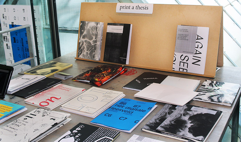
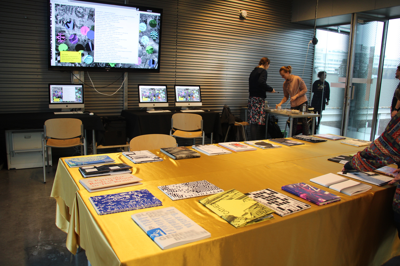
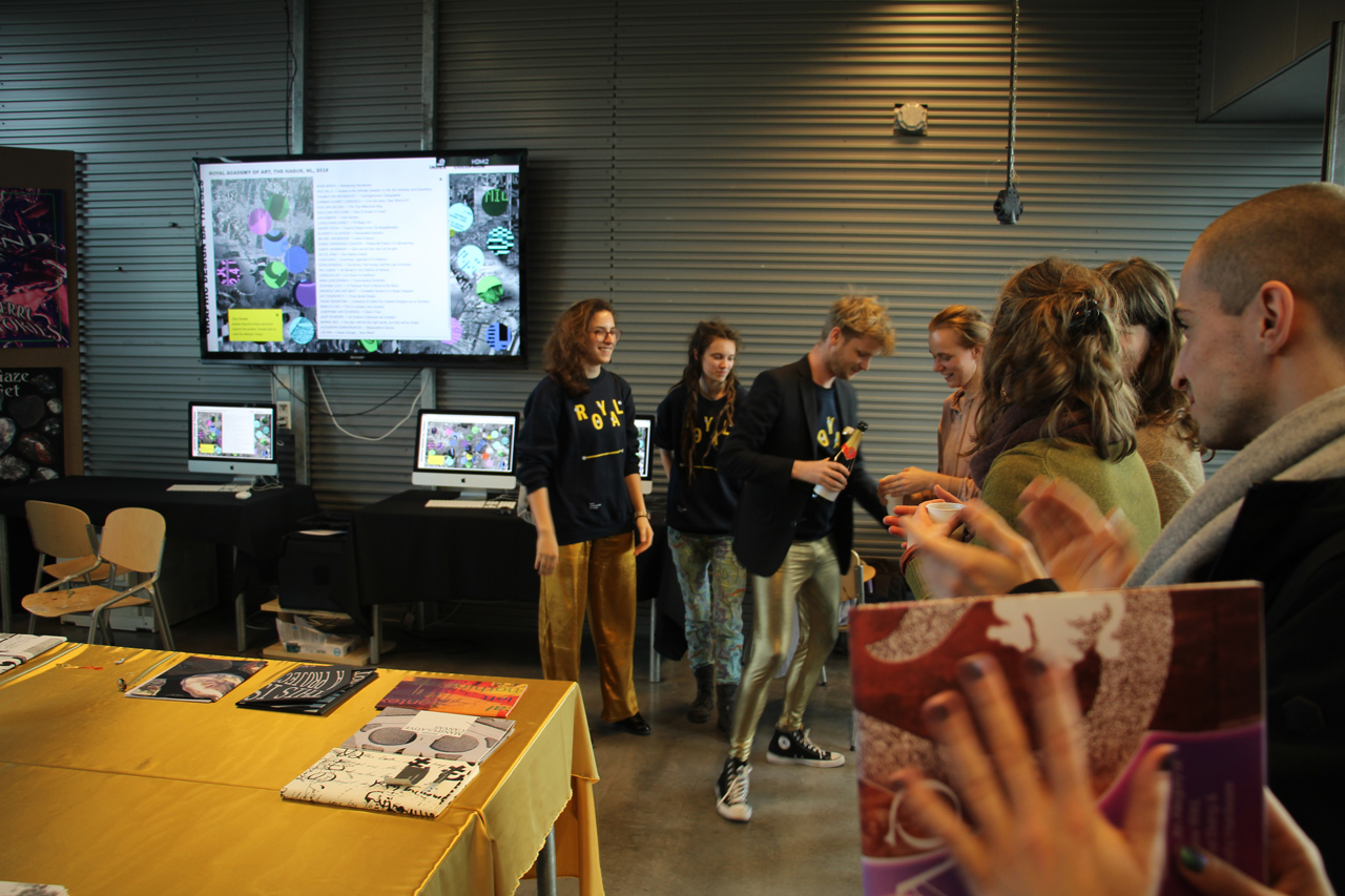
Today the graduation exhibition opens at the Royal Academy of Art, The Hague. Every year, the graduates of the The Graphic Design department present their self-initiated project with which they conclude the four year program. They also show their thesis, which has become an import part of the course: it allows the students to research into a specific area of interest and will provide a theoretical foundation for their final exam project.
In the bachelor program that used to be known for its focus on typography, heads of department (2013–) Roosje Klap and Niels Schrader have introduced an emphasis on social responsibilities and digital technologies. Over the last four years we’ve worked together with an amazing set of students and teachers to create a workflow for sharing and publishing the theses.
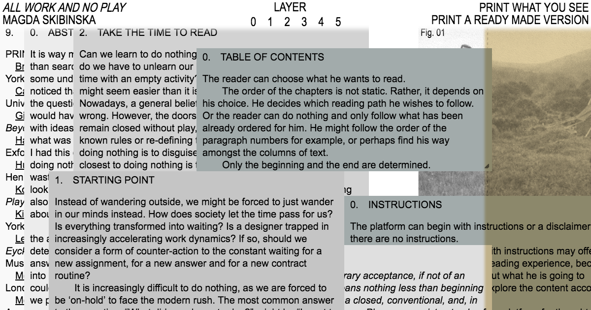
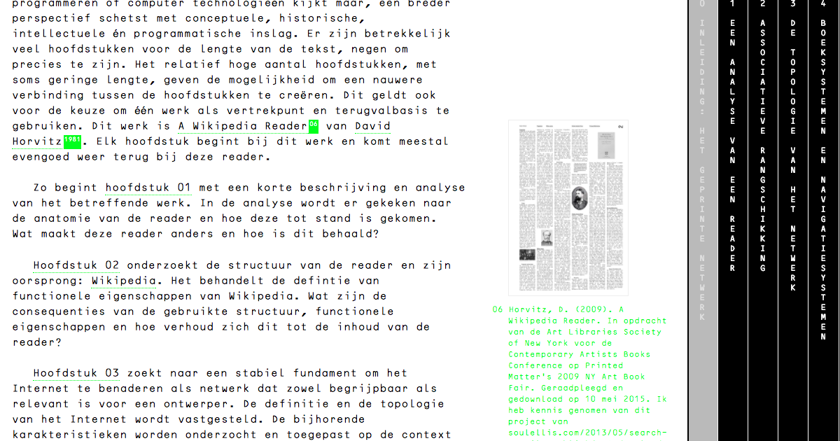
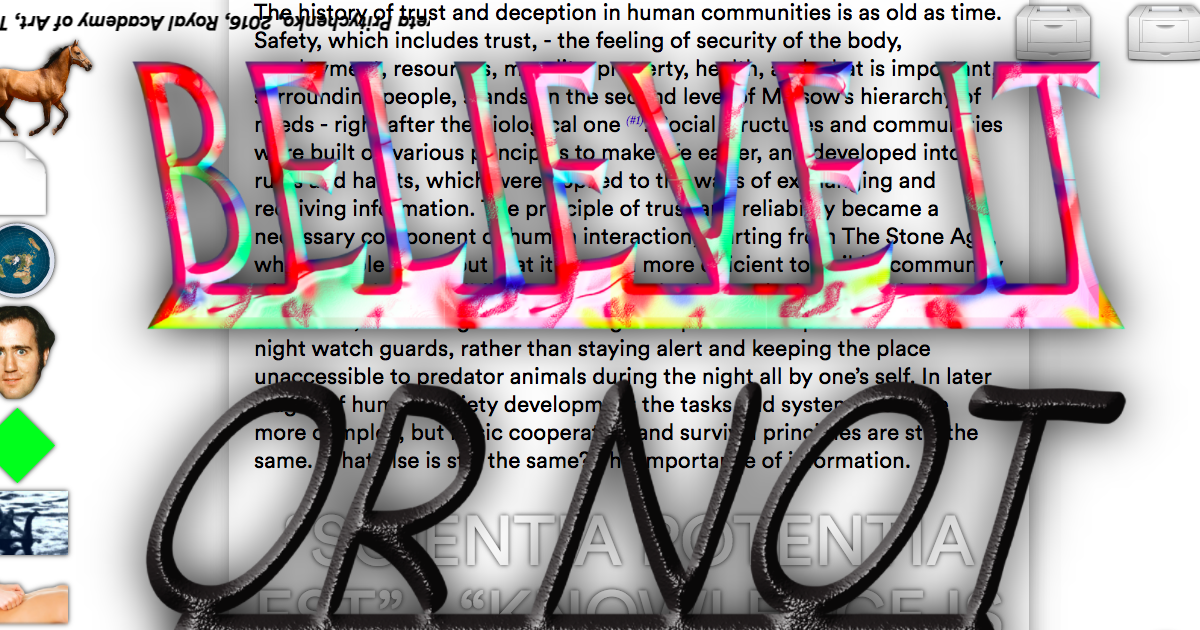
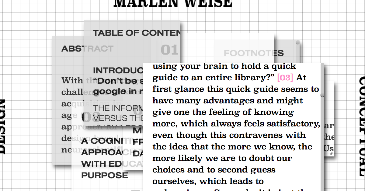
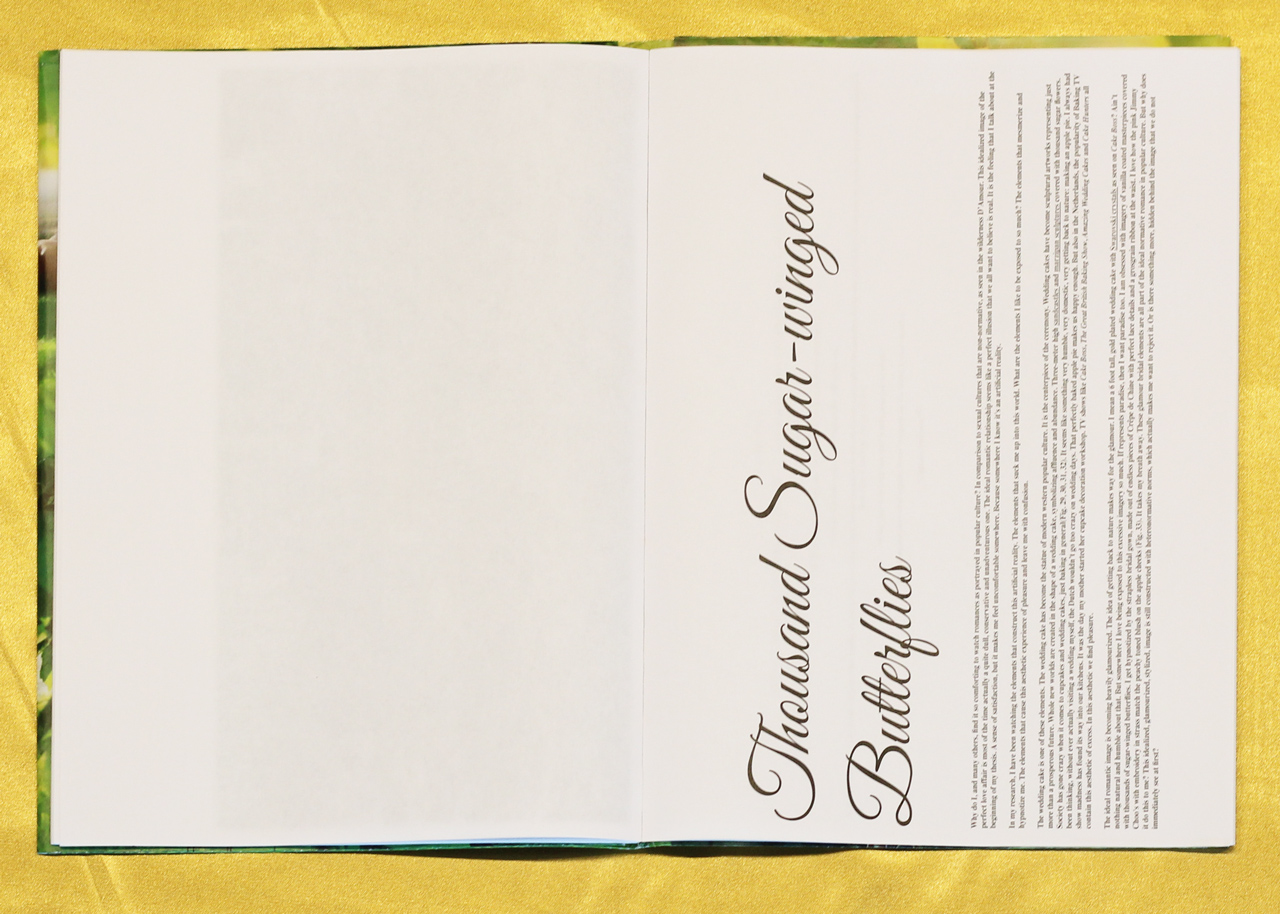
Students put a lot of work into these documents, and not only write but also design them. Earlier on, the work put into the thesis would not necessarily be reflected in the subsequent exposure and distribution: the theses would be printed in a small number of copies, that were shown at the end exam exhibition and archived in the school library. However, the exhibition is not an ideal context for reading a longer text and while the school’s library is great, it’s not easy to make visible the wealth of student publications that it hosts. That is why, to benefit from the possibility of sharing the research with a wider audience, the theses have started to be designed for the screen and published online as digital publications.
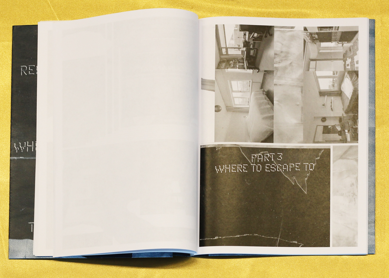
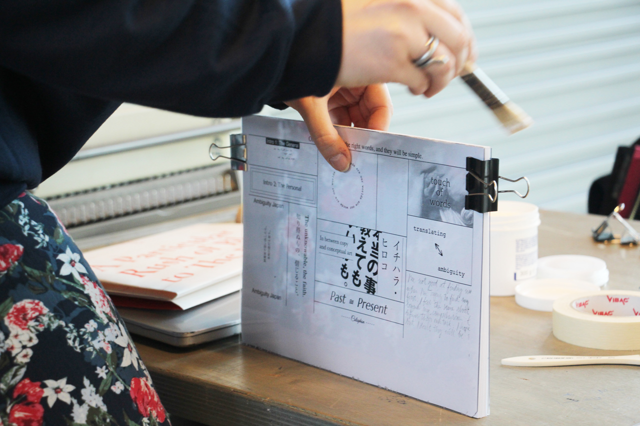
Students develop the design for screen simultaneously with a design for print. The results for the class of 2015, the class of 2016, the class of 2017 and the class of 2018 are all available online. You can consult them from the screen, or generate a print version with the print option in your browser. The students follow a process called ‘hybrid publishing’: creating a design that adapts itself to different media. To do so, they follow a workflow that leverages technology both old and new, and which allows them to design beyond the constrains of traditional, template-based content management systems.
Life after the template
The first texts to be shared online were academic papers, and the separation of form and content that is habitual in academic publishing has permeated every aspect of the online publishing eco-system. The challenge has been to come up with a workflow for creating digital theses that gives the students the needed flexibility to express their ideas both in writing and design. A thesis is not the same thing in art education as it is in academia. Scientific publications often choose a pre-formatted form. Magazines will provide templates to follow for authors, that in most cases use Microsoft Word or the LaTex authoring system. In contrast, the students in The Hague are are expected to engage in the design of their thesis, creating a design that is specific to their topic. Form and content are decidedly mixed. Clearly, the last thing we want to do is give the students a template.
There are additional requirements. With a group of 50 students, we need to be able to follow the process of all students, be able to give feedback. Also, we are legally required to archive all theses. Finally, we want to publish the theses online in an accessible and durable way.
Writing websites like it’s 1999
The landscape of web technology is varied and ever changing. Creating an advanced web project might include choosing a server side programming language (Python, PHP, Node.js) that talks to a database of choice, then creating the visual and interaction design on top of a foundation of front-end ‘frameworks’ and ‘pre-processors’. The amount of choices to make is staggering, and the complexities of such systems high. For the project at the KABK we have foregone these technologies, for a more simple, back to basic approach: writing HTML pages.
The first web-sites did not use databases or other complex systems: they were hand-crafted HTML. Many small sites were created as a series of HTML pages, with occasional updates (the person designing the site might then charge for each update!). Coding was not always necessary: tools like Adobe Dreamweaver provided both a visual view and a code view.
The democratisation of Content Management Systems like WordPress and Joomla have changed the equation. In these systems, a general design is encoded into a template, and the contents for individual pages are stored in a database that is easily editable by the user. For clients this saves time and money. The downside is that a Content Management System requires shoehorning every page into templates: these early HTML pages offered much more freedom in this respect, as potentially every page could be modified and changed to the designer’s whims. This is why we chose to make hybrid web publications the same way I made websites in the 1990ies: constructing both design and content by typing HTML tags into a code editor.
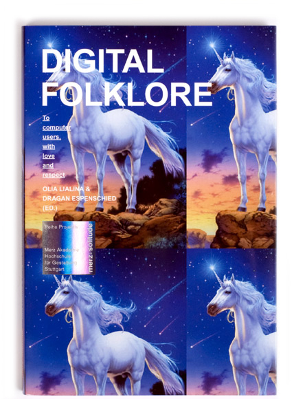
The workflow proposed for the theses thus resembles the cultural moment lovingly captured by Ola Lialina and Dragan Espenschied in the publication Digital Folklore. The period in the 1990ies when large groups of enthousiasts learned and experimented with the fabric of the web, creating their own websites on such digital platforms as Geocities and in the process shaping the visual codes of the medium.
There is a reason of course, that Content Management Systems have become popular: not only are they cheap to update, they are also easy to use for editors. They allow a separation of roles: design, editing, maintenance. They also create archives and indexes automatically. They make it easy to collaborate with larger teams and they require less technical knowledge for a part of the contributors.
There is a counter-history to these systems. As soon as printing and design started to exist as industrial endeavours, and brought along a separation of concerns, individual writers and designers have tried to blur distinctions and to exert their influence outside their appointed area of expertise. Whether it’s William Morris setting up the whole chain of production when publishing his writings with his own Kelmscott press, or the feminist movements of the 1970ies that created women’s presses, these movements are as much about the potential of achieving a coherent creative expression through the mastery of the process, as they are about the political implications of creative workers being able to own the means of their own production.
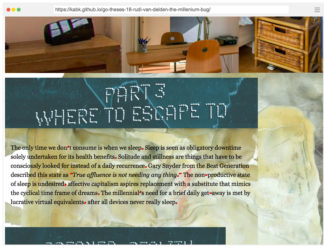
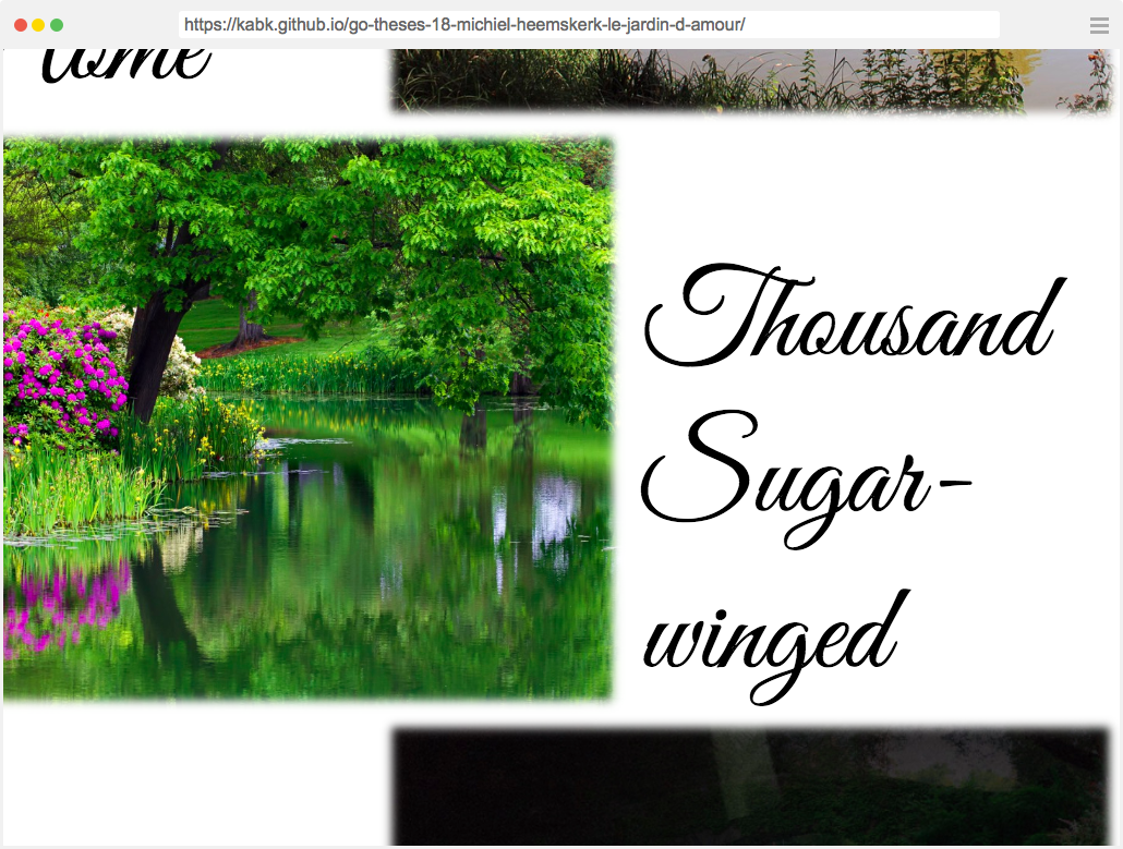
For graphic designers now, to return to the foundational languages of the web, and use these to write, design and publish their texts, is an opportunity both educational and potentially empowering. Even if the KABK students had three years of both coding and interaction design courses before starting on the thesis, this project really allows them to appropriate these technologies more fully still, and make them a part of their narrative. Here are some examples from recent years:
Designing for post-digital print
The screen is now our primary medium to access information. It has displaced the printed medium in this regard. Yet print is not quite dead. Rather, it is thriving in the form of art book fairs and small publishers popping up all over the world. To understand this, it is helpful to consider the screen and print not as as a dichotomy but rather as a symbiotic relationship. This is what Alessandro Ludovico does in his book ‘Post-digital Print’.
Our students are invested in print publishing. Not only does the printed book offer a great interface for reading, books also offers what seems like a stable reference points in the flux of digital channels. Additionally, printed publications provide a number of valuable rituals, from book launches to the aforementioned fairs, that have no real equivalent in the on-line world. That’s why we decided to embrace the double nature of publishing today and ask students to make both screen and print versions.
At the same time, we did not want to separate completely the production process between print and screen. We wanted to work in a way that would have the students invested in the base materials of today’s publishing channels. We wanted them to have the time to properly get their hands dirty in HTML and CSS, and to think how these technologies affect the way we design today. That is why we chose for a ‘Hybrid Publishing’ approach, in which the design is conceived with web technologies, in such a way that it can adapt both to different screen sizes and to a printed output. This is achieved by using the techniques that are the basis of ‘Responsive Design’: ‘Media Queries’ allow different styles to be applied for different media.
Responsive Design is best known for allowing a web-design to be implemented across devices: from phones to tablets to desktop computers. But the same technology can also be used to differentiate the design from screen to the printed output. Dedicated products like Prince XML allow to create PDF’s from HTML pages, but your web browser is capable of this as well: simply choose the option ‘Print’ from the browser’s menu.
Printing is not a core concern for browser vendors. That is why the concerned standards advance slowly, and are not supported fully. When creating printed pages from the browser, it is hard to gain the same kind of control that one would have in a DTP program like Scribus or inDesign. By using a commercial PDF generation program like Prince, we could gain back some of that control. But we chose to work with the browser. The browser has the unique advantage, that if we publish the webpage online, not only will people everywhere be able to read it on their screens, they will also be able to print it themselves. The design adapts automatically.
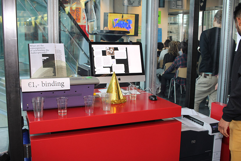
Print parties
With the collective Open Source Publishing, I’ve been involved in what we called ‘print parties’. The decision to work with hybrid publishing enabled us to create print parties with the KABK, at the open days and the final exam exhibition.
Working with GitHub
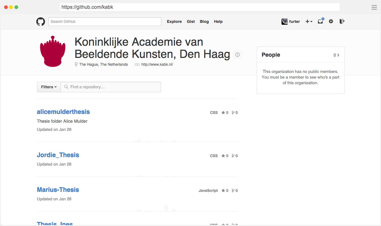
GitHub is a code hosting site that focuses on facilitating the collaboration between developers. It is built on the Open Source software Git. Each contributor works on their own computer, on their own version of the files. They can then use Git to merge their changes with those of others. GitHub also offers the possibility to publish files to the internet. This feature is usually used to publish the documentation for a code project, contained in a special branch. Our ‘hack’ was to only use this branch for the theses. The result was a very nimble workflow: each file-change uploaded to Github was immediately published online.
Most students had no prior experience with Git—getting everybody set up and comfortable with the system did take time. Doing this in the class-room made sure students could help each other out, and minimised the frustration associated with trying unknown technologies.
The setup proved extremely practical for the tutors. Having the work in progress online, they can simply click through links instead of having to download code. This does mean in-progress texts are publicly accessible. To mitigate this potential problem we have shown students how to hide from search engines.
Turning the database inside out
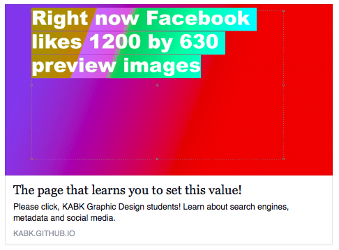
One major advantage of data-base driven Content Management Systems is that it is very easy to generate indexes. The same database from which a single page will be fetched, will just as happily generate a listing of pages, sorted and filtered as the designer demands. Because most CMS’s are dynamic, these indexes will be kept up to date automatically: every time the page is rendered, the indexes will be re-generated. To create indexes from a collection of HTML files is more involved: since there is no neat database model with fields like ‘title’, ‘author’, ‘publishing date’, one will need a way to discover these metadata from the HTML.
Creating indexes by hand is one option, but this is error-prone and tedious. It becomes even more involved when the indexes themselves are part of the pages, like in the submenu of a publication that show links to other pages. If a collaborator on another page changes its title, or a new page gets added, this submenu should be updated in every page—again, tedious and error-prone. With the theses at the KABK we decided to tackle the first problem: create indexes from a series of initially unstructured HTML files. Each thesis is contained in its own folder, and the theses are largely independent from another. We create an index page that lists all theses. We do not (yet) have any intra-thesis navigation within the theses themselves—a challenge to tackle on a subsequent project. The way we do this, is indexing the pages in much the same as search engines like Google, and social networks like Facebook and Twitter do: we visit each page and read out provided metadata like title, author and preview image.
Beyond the designer-writer-artisan
The workflow we came up with combines a new hybrid approach with time-tested web publishing technologies, and is a good fit for a digital designer/writer/artisan. It allows for the necessary expressiveness: students are able to come up with the appropriate design for their text, unhindered by pre-existing templates. It is also remarkably practical for the tutors, since they can follow up on student work easily. The school benefits by having the work automatically published and archived online.
The downside to our approach is that the interface of the code editor is not ideal for all parts of the process. Tasks such as writing and editing could be more easy to perform in a WYSIWYG interface, also for those who know how to write code. In that sense, it should be noted that HTML has the potential to allow such interfaces. HTML is a rich format, that allows to build abstractions on top of it. This is more so the case than with oft-used alternatives like Markdown, which force a text-based approach on all collaborators. HTML allows us to imagine separate interfaces for writing, editing, coding and designing.
by Eric - March 14, 2019 7:13 PM
Reply